With Kirby 3.6 introducing support for WebP & AVIF images and the lazy-attribute being well supported by modern browsers this plugin has in my opinion become obsolete. Thus I will not continue to work on it.
, (*1)
Kirby 3 Srcset


 , (*2)
Kirby 3 Plugin for creating lazyloading image srcset
This plugin extends the core (image: )-Kirbytag. All params that work for (image: ) can be used with (lazysrcset: ) yielding the same output. By default the plugin does add the following:, (*3)
-
lazyloading class to the img element
-
data-src image based on the params of the tag width, height, quality. This replaces the src attribute.
-
data-srcset attribute with srcsets generated by Kirbys core $file->srcset() method
-
data-sizes="auto" attribute
-
data-thumb-srcset attribute printing the srcset array as json (only when debugging)
-
data-ratio attribute with ratio of the image to parent of img element
- It registers a custom markdown component since needs to wrap and unwrap the markdown.
TOC
- Commercial Usage
- Installation
- Usage Kirbytag
- Usage Editor Block
- Usage PHP
- Setup
- Settings
- FAQ
- Image Ratio
Commercial Usage
Support open source!
This plugin is free but if you use it in a commercial project please consider to sponsor me or make a donation.
If my work helped you to make some cash it seems fair to me that I might get a little reward as well, right?
Be kind. Share a little. Thanks.
‐ Bruno
, (*4)
Installation
- unzip master.zip as folder
site/plugins/kirby3-srcset or
-
git submodule add https://github.com/bnomei/kirby3-srcset.git site/plugins/kirby3-srcset or
composer require bnomei/kirby3-srcset
Usage Kirby Tag
| image |
lazysrcset |
| alt, caption, class, height, imgclass, link, linkclass, rel, target, text, title, width |
sizes, lazy, prefix, autosizes, quality, figure |
# like image tag
(image: myfile.jpg)
(lazysrcset: myfile.jpg)
(lazysrcset: myfile.jpg link: mypdf.pdf)
(lazysrcset: myfile.jpg class: myclass)

# changing width, height and/or quality of src (not srcset)
(lazysrcset: myfile.jpg width: 640 height: 480 quality: 70)

# different lazy class
(lazysrcset: myfile.jpg lazy: lazy)

# different or no prefix
(lazysrcset: myfile.jpg prefix: )

# remove wrapping figure element
(lazysrcset: myfile.jpg figure: false)

# remove the ratio information
(lazysrcset: myfile.jpg ratio: false)

# sizes from config
(lazysrcset: myfile.jpg sizes: default)
(lazysrcset: myfile.jpg sizes: breakpoints)

# sizes are supported in various formats
# string, number(s), with and without px, comma and brackets
(lazysrcset: myfile.jpg sizes: 320 640 960)
(lazysrcset: myfile.jpg sizes: [320, 640, 960])
(lazysrcset: myfile.jpg sizes: 320px, 640px, 960px)
Usage Editor Block
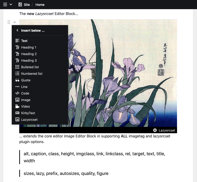 , (*5)
Specifically allow plugin block, (*6)
When you specifically define which blocks are allowed in an editor field you need to add the plugin block like this:, (*7)
yaml
 fields:
  text:
    label: Editor
    type: editor
    allowed:
      - h1
      - paragraph
      - srcset # matches name of plugin
, (*8)
Usage PHP
echo $page->image('ukulele.jpg')->lazysrcset();

// 320 and 1200
echo $page->image('ukulele.jpg')->lazysrcset('default');

// 576, 768, 992, 1200
echo $page->image('ukulele.jpg')->lazysrcset('breakpoints');

// 320, 640, 960
echo $page->image('ukulele.jpg')->lazysrcset(['sizes' => [320, 640, 960]]);

// other options
echo $page->image('ukulele.jpg')->lazysrcset([
    // lazysrcset
    'sizes' => [320, 640, 960],
    'lazy' => 'lazyloading-with-flickity',
    'prefix' => 'data-flickity-lazyload-',
    'figure' => false,
    'autosizes' => false,
    // image
    'width' => 640,
    'height' => 480,
    // ...
]);
Setup
Config
You need to define srcsets. The plugin will use these as well as the core $file->srcset() function., (*9)
/site/config/config.php, (*10)
return [
    'thumbs' => [
        'srcsets' => [
            'default' => [320, 1200],
            'breakpoints' => [576, 768, 992, 1200],
        ],
    ],
];
JS
Add aFarkas/lazysizes to your js dependencies and RTFM. You can also use lozad.js with little adjustments in the settings., (*11)
Minimal CSS for auto-sizes detection
You will need some css to make the lazysizes lib automatic size detection work., (*12)
css
 figure { width: 100%; }
 img[data-sizes="auto"] { display: block; width: 100%; }
, (*13)
IMPORTANT: The css must be applied to the DOM before the JS is executed. Make sure the order is right and they are not async applied. With a lib like muicss/loadjs you can load them asyn and apply them in proper order. Otherwise you will face blurry images on first load., (*14)
CSS for hinted image ratio
By default the images ratio is hinted by the plugin to minimize reflows and avoid page jumps. You just need to add the following css to you codebase., (*15)
TIP: you can use a different class name if you set ratio to a different string. If you set either ratio or figure to false the ratio hints will disappear., (*16)
CSS, (*17)
/* class name must matches the value of `ratio` setting. */
.lazysrcset-ratio {
    position: relative;
}
.lazysrcset-ratio > img {
    display: block;
    width: 100%;
    height: 100%;
    position: absolute;
    top: 0;
    left: 0;
}
.lazysrcset-ratio > img:after {
    display: block;
    width: 100%;
    height: 0;
    content: '';
}
tailwind.css, (*18)
.lazysrcset-ratio {
    @apply relative;
    & > img {
        @apply absolute top-0 left-0 w-full h-full block;
        &:after {
            content: '';
            @apply block h-0 w-full;
        }
    }
}
Each figure element will be prefixed with a style element defining the ratio. For example the css style for an image with 16/9 ratio followed by its figure image element would look like this:, (*19)
without figcaption: figure > img, (*20)
<style>.lazysrcset-ratio[data-ratio="56.25"]{padding-bottom:56.25%;}</style><figure data-ratio="56.25" class="lazysrcset-ratio"><!--- image tag with srcset --></figure>
with figcaption: figure > ((div > img) + figcaption), (*21)
<style>.lazysrcset-ratio[data-ratio="56.25"]{padding-bottom:56.25%;}</style><figure><div data-ratio="56.25" class="lazysrcset-ratio"><!--- image tag with srcset --></div><figcaption>with caption</figcaption></figure>
with nonce, (*22)
You can set a custom nonce using the options or install the security headers plugin., (*23)
<style nonce="A-NONCE-HERE">...
Settings
| bnomei.srcset. |
Default |
Description |
| lazy |
lazyload |
bool or string. additional class for imgclass param |
| prefix |
data- |
bool or string. prefix before srcset and src when doint lazy loading |
| autosizes |
auto |
bool or string. related to data-sizes attribute |
| figure |
true |
bool. wrap image in figure or not |
| ratio |
lazysrcset-ratio |
bool or string. adds data-ratio to parent of img
|
| nonce |
null |
null, string or callback. default nonce for style element |
FAQ
- Does the plugin override the
(image: )-Kirbytag? No and it never will.
- Why is the Javascript library for lazy loading not included? Since that should be part of the websites build chain.
- IE11 support? You will need a Picture Polyfill.
- Why is there no
sizes attribute? It is not defined since js lib lazysizes can create these on-the-fly based on actual screen size of image. see autosizes setting.
-
Lazyloading with Flickity? Do
'prefix' => 'data-flickity-lazyload-'.
- Where is the picture element support? This plugin v2.x.x versions could do picture element. I removed that and focused on a better kribytag and lazyloading to make the plugin simpler again.
Works well with
Disclaimer
This plugin is provided "as is" with no guarantee. Use it at your own risk and always test it yourself before using it in a production environment. If you find any issues, please create a new issue., (*24)
License
MIT, (*25)
It is discouraged to use this plugin in any project that promotes racism, sexism, homophobia, animal abuse, violence or any other form of hate speech., (*26)
 Wallogit.com
